
Introduction to Web Design’s Impact
In the bustling metropolis of London, businesses face fierce competition and rapidly evolving consumer expectations. The role of web design extends far beyond mere aesthetics; it encompasses the overall user experience and brand perception. A thoughtfully crafted website not only attracts visitors but also keeps them engaged, guiding them seamlessly towards making a purchase. In an environment where attention spans are increasingly short, an intuitive and visually pleasing design becomes essential. Elements such as layout, typography, colour schemes, and imagery must work in harmony to create an inviting and functional digital space. The influence of web design on buyer decisions is particularly pronounced in a city like London, where a diverse and dynamic population demands innovation and accessibility. Effective web design helps businesses communicate their values, showcase their offerings, and build trust with their audience. It’s about creating an online experience that reflects the brand’s identity while meeting the needs and preferences of its target market. In this context, understanding the principles of web design and their impact on consumer behaviour can provide a significant competitive advantage. Whether it’s through sleek, modern aesthetics or user-friendly navigation, a well-designed website can set a business apart and drive consumer engagement in a meaningful way.
First Impressions Matter
Visual appeal plays a crucial role in capturing a user’s attention within moments of landing on a website. Research has shown that users form an opinion about a website in as little as 50 milliseconds, emphasising the need for an engaging and aesthetically pleasing design. A well-executed design can entice visitors to explore further, while a cluttered or outdated layout can result in a high bounce rate. Statistics indicate that a significant majority of first impressions are based on the design of the site, highlighting the importance of a visually appealing and professional web presence.
In a vibrant city like London, where the market is saturated with businesses vying for consumer attention, creating a strong first impression through web design becomes even more essential. Elements such as layout, typography, and imagery should work together harmoniously to draw users in and encourage them to stay. A clean, organised layout with intuitive navigation ensures that users can find what they are looking for quickly and effortlessly, thereby reducing the likelihood of frustration and abandonment.
Furthermore, the use of high-quality images and consistent branding can significantly enhance the initial impression. Visitors are more likely to trust and engage with a website that looks polished and professional. This trust is critical in guiding them through the buying process, as it reassures them of the business’s credibility and reliability.
In essence, first impressions are not just about attracting attention but about building an immediate connection with the user, setting the stage for a positive and productive online experience.
Colour Psychology in Web Design
Colours can significantly influence emotions and decisions, making them a powerful tool in web design. Different hues can evoke specific feelings and reactions, impacting how users interact with a website. For instance, blue is frequently linked with trust and dependability, often used by financial institutions to instil a sense of security. Red, on the other hand, can create a sense of urgency or excitement, making it effective for calls to action and promotional messages.
In a diverse city like London, businesses have adeptly harnessed colour psychology to resonate with varied audiences. Green is a popular choice for eco-friendly brands, signalling sustainability and nature, while luxury brands might opt for black to convey sophistication and exclusivity. The strategic use of colours helps to communicate a brand’s message and values subtly yet powerfully.
Moreover, the context in which colours are used can further influence their effectiveness. For example, a calming blue background paired with white text can make reading more comfortable, enhancing user experience. Meanwhile, accent colours can draw attention to key elements such as buttons and links, guiding users intuitively through the site.
It’s also worth considering cultural differences in colour perception, especially in a multicultural hub like London. What may be a positive colour in one culture could have negative connotations in another, so it’s essential to research and understand these nuances.
Overall, the thoughtful application of colour psychology in web design enables businesses to create a cohesive and engaging online presence that appeals to their target audience and enhances user interaction.
Typography and Readability
The choice of font significantly affects how users interact with and perceive a website. A well-selected typeface can enhance readability, ensuring that users can effortlessly digest content without straining their eyes. In a bustling city like London, where users often access websites on the go, ease of reading is paramount. Sans-serif fonts are frequently favoured for their clean, modern appearance, which enhances legibility and aligns well with contemporary design aesthetics. It’s not just about picking a stylish font; it’s about ensuring that the text is approachable and straightforward to read across various devices and screen sizes.
Hierarchy in typography is equally important, as it guides the reader’s eye through the content. Headings, subheadings, and body text should have clear distinctions in size, weight, and style to create a logical flow and make information easy to scan. This is especially vital for mobile users, who may be looking for specific information quickly. Line spacing and letter spacing also play crucial roles in readability, making text blocks more accessible and less overwhelming.
For businesses targeting London’s diverse population, it’s essential to consider accessibility in typography choices. This includes selecting fonts that support multiple languages and characters, ensuring that everyone can access and understand the content. Additionally, the use of contrasting colours for text and background can improve visibility, particularly for users with visual impairments.
Overall, thoughtful typography not only enhances the visual appeal of a website but also improves user experience by making information clear and accessible. This attention to detail can significantly influence how users perceive and interact with a brand online.
Imagery and Visual Content
Images play a vital role in establishing buyer trust and enhancing the visual appeal of a website. In the competitive London market, high-quality visuals can make a significant difference in attracting and retaining customers. The choice of imagery should not be random but thoughtfully selected to align with the brand’s message and target audience.
For instance, local businesses might incorporate images of well-known London landmarks or culturally significant visuals to foster a connection with their audience. This not only personalises the user experience but also imbues the website with a sense of place and authenticity. Using professional photographs rather than stock images can further enhance credibility and resonate more effectively with users.
Visual content goes beyond just photographs; illustrations, icons, and videos can also be powerful tools in conveying information and engaging users. Infographics can simplify complex data, making it more accessible and engaging. Videos, whether they are product demonstrations, customer testimonials, or brand stories, can provide a dynamic and immersive experience that keeps users engaged longer.
Consistency in imagery is also crucial. Using a coherent visual style throughout the website helps to build a strong brand identity. This includes maintaining a consistent colour palette, style, and tone that align with the overall brand aesthetics.
Lastly, it’s essential to optimise images for web use to ensure fast loading times, particularly important for mobile users. High-resolution images should be compressed appropriately without compromising quality, balancing visual appeal with performance to provide an optimal user experience.
Navigation and User Experience
Navigation is fundamental to a seamless user experience. When users can effortlessly find what they are looking for, it enhances their overall satisfaction and likelihood of making a purchase. Effective navigation involves clear, intuitive menus that guide users through the site logically. Dropdown menus, breadcrumbs, and a well-structured header and footer can significantly aid in this process.
Search functionality is another crucial element. A prominent, easy-to-use search bar allows users to quickly locate specific products or information, which is particularly valuable on larger websites with extensive inventories or content libraries. Filters and sorting options further refine search results, helping users zero in on what they need without unnecessary hassle.
Logical information architecture underpins all these elements. Grouping related content together and using clear, descriptive labels ensures that users can predict where to find information. This reduces frustration and keeps users on the site longer.
Fast load times are also critical, as slow-loading pages can deter users and increase bounce rates. Optimising images and employing efficient coding practices can help maintain a swift user experience.
Interactive elements like hover effects and dropdown animations can make navigation feel more engaging without overwhelming the user. However, these should be used sparingly to maintain a clean, professional appearance.
User feedback can offer valuable insights into how well a site’s navigation functions. Regularly testing and refining the navigation based on this feedback ensures that it remains user-friendly and efficient. This continuous improvement is essential in meeting the evolving expectations of a diverse and dynamic audience.
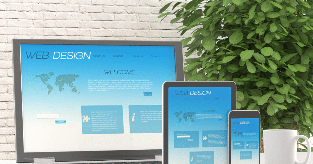
Mobile Responsiveness
In an era where mobile devices dominate internet usage, ensuring your website is mobile-responsive is paramount. London, with its fast-paced lifestyle, sees a significant number of users accessing websites on their smartphones and tablets. A responsive design automatically adjusts to different screen sizes, offering an optimal viewing experience whether on a mobile, tablet, or desktop.
Responsive design goes beyond merely shrinking content to fit smaller screens; it involves rethinking the layout to ensure usability and readability. Touch-friendly navigation is crucial, with buttons and links appropriately sized and spaced to accommodate finger taps rather than mouse clicks. Simplified menus, often collapsed into a ‘hamburger’ icon, make it easier for users to navigate without overwhelming them with options.
Load times are particularly critical on mobile devices, where slower connections can frustrate users. Ensuring that images and other media are optimised for mobile can significantly reduce loading times, providing a smoother user experience. Techniques such as lazy loading, where images only load as they come into view, can further enhance performance.
Given London’s cultural diversity, multilingual support is another aspect to consider in mobile responsiveness. Providing easy access to language options ensures that non-native English speakers can navigate your site with ease, broadening your reach.
Additionally, features like click-to-call buttons and integration with map applications can provide immediate value to mobile users looking for quick ways to contact or locate a business. Considering the needs of on-the-go users in London can enhance their interaction with your site, making mobile responsiveness not just a technical requirement but a strategic advantage.
Consistency in Branding
Maintaining a cohesive brand identity across a website is essential for reinforcing recognition and building consumer trust. Every design element, from colour schemes to typography, should align with the brand’s established image and messaging. In a competitive environment like London, where businesses strive to stand out, consistency becomes a vital aspect of a successful web presence. A uniform look and feel across all digital touchpoints, including social media profiles and email marketing campaigns, ensures that the brand is instantly recognisable to users.
Colour palettes should be consistently applied throughout the site to create a harmonious visual experience. Similarly, typography choices should reflect the brand’s personality and be used uniformly across headings, subheadings, and body text. Imagery and visual content must also adhere to the brand’s style guidelines, whether it’s the use of professional photographs or custom illustrations.
Consistency extends to the tone of voice in written content, which should reflect the brand’s values and resonate with its target audience. This includes everything from product descriptions to blog posts, ensuring that the brand communicates in a singular, cohesive manner.
Incorporating brand logos and icons at strategic points within the website further solidifies the brand’s identity. These elements should be used in a way that complements the overall design without overwhelming the user.
Ultimately, a consistent branding strategy in web design not only enhances aesthetic appeal but also fosters a sense of reliability and professionalism, crucial for winning consumer trust in a bustling city like London.
Cultural Sensitivity in Design
In a city as diverse as London, businesses must approach web design with cultural sensitivity to ensure inclusivity and respect for all users. This requires a careful consideration of various cultural norms and values, avoiding any design elements that might perpetuate stereotypes or cause offence. Understanding the cultural significance of colours is essential, as different hues can carry various meanings across cultures. For instance, while white is often associated with purity in Western cultures, it can symbolise mourning in some Eastern traditions. Therefore, businesses should research their target demographics thoroughly to avoid cultural faux pas.
Imagery used on the website should be chosen with an awareness of cultural representation. Including diverse and representative visuals can help create a sense of belonging for all users. Avoiding cultural appropriation and ensuring that images are respectful and accurate representations of different groups is crucial.
Language and content should also be tailored to reflect cultural sensitivity. This means not only translating content accurately but also considering the context and nuances that might affect how the message is received. Using local expressions and avoiding idiomatic phrases that might not translate well can improve clarity and relevance for a broader audience.
Furthermore, businesses should be mindful of different cultural practices and traditions, such as holiday celebrations or important dates, and reflect these appropriately in their design and content updates. This approach helps in fostering a more inclusive and engaging online environment, making all users feel respected and valued.
Trust Signals in Web Design
Establishing trust through web design is essential for converting visitors into customers. Visual cues like secure payment icons, customer reviews, and testimonials can effectively communicate a website’s reliability. Including badges for SSL certification and affiliations with recognised organisations provides an additional layer of security for users. Displaying customer reviews and testimonials prominently can lend credibility and encourage new users to make a purchase. Trust can also be fostered through transparent and accessible contact information. A dedicated ‘Contact Us’ page featuring multiple ways to get in touch, such as phone numbers, email addresses, and physical addresses, demonstrates that the business is approachable and accountable.
Using real images of staff, offices, and products instead of stock photos can also help in building authenticity. Another effective method is showcasing case studies or success stories that detail real-world applications of your products or services. These narratives offer concrete proof of value and effectiveness, further reinforcing trust. Consistently updated content, such as blog posts and news articles, indicates that the website is actively maintained and the business is engaged with its audience. Finally, a clear and concise privacy policy reassures users about how their data will be handled, making them more likely to feel secure whilst interacting with the site.
Interactive Elements and Engagement
Interactive features can significantly enhance user engagement on a website. Elements such as chatbots, interactive infographics, and quizzes encourage users to interact with the site, leading to a more engaging experience. In London, businesses that incorporate innovative and interactive designs often stand out and create lasting impressions on their audience.
Interactive elements like live chat support can provide immediate assistance, answering queries and resolving issues in real-time, thereby improving customer satisfaction. Interactive infographics make complex data more digestible and visually appealing, fostering a deeper understanding of the information presented.
Quizzes and polls can be used to gather user opinions and preferences, providing valuable insights for businesses while keeping users entertained. Gamification, where users earn points or rewards for engaging with the site, can also be an effective strategy to increase user interaction and loyalty.
Additionally, personalised content based on user behaviour and preferences can make the browsing experience more relevant and engaging. Features such as recommendation engines, which suggest products or content based on previous interactions, can significantly enhance user experience.
Finally, incorporating social media integration allows users to share content effortlessly, extending the website’s reach and engagement. By embedding social sharing buttons and live feeds, businesses can create a more connected and interactive online environment.
Trends in London Web Design
London’s web design landscape is ever-evolving, influenced by a mix of local culture and global trends. Minimalism remains a prominent trend, characterised by clean lines, ample white space, and straightforward navigation, which enhances user focus and clarity. Bold typography is increasingly used to make a statement and create visual hierarchy, drawing attention to key messages and calls to action.
Immersive storytelling through web design is gaining traction, with more sites incorporating long-scroll formats and interactive elements to engage users in a narrative journey. This approach often involves the use of high-quality visuals, animations, and micro-interactions to create a dynamic and engaging user experience.
Dark mode has also become popular, offering a sleek and modern aesthetic while reducing eye strain for users. This is particularly effective for highlighting vibrant colours and detailed graphics.
Additionally, the use of custom illustrations and bespoke iconography is on the rise, helping brands to convey their unique identity and stand out in a crowded market.
As the use of mobile devices continues to grow, responsive design remains a critical focus, ensuring that websites function seamlessly across all screen sizes. London businesses are also increasingly prioritising accessibility, making their sites usable for all individuals, including those with disabilities.
Conclusion
The impact of website aesthetics on buyer decisions cannot be overstated. A well-designed site captures attention, facilitates ease of navigation, and builds trust with visitors. Effective use of colours, typography, and imagery ensures that users feel welcomed and understood, while consistent branding reinforces recognition and reliability. In a diverse and competitive market like London, businesses must prioritise mobile responsiveness and cultural sensitivity to cater to a broad audience. Trust signals, interactive elements, and clear navigation contribute to a positive user experience, encouraging engagement and conversions. By focusing on these key aspects, London businesses can create an engaging and trustworthy online presence that resonates with their target audience.